Pivot tables
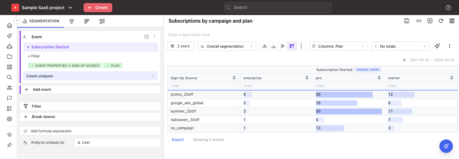
A pivot table answers questions that have two things in them at once — "how many signups, by campaign and by plan?" It puts one of them down the side, the other across the top, and the number for each combination where they meet.
A bar chart can only really show you one of the two. A pivot table shows both, so you can read a single row, compare a whole column, and spot the one combination that stands out.
Use cases
Pivot tables are useful whenever you want to compare two things at the same time. Typically, the questions you can answer with one look like this:
Acquisition and marketing
- Which campaigns bring in customers on our most expensive plans — not just the most signups?
- Does a channel that works well in one country work anywhere else?
Product
- Which features does each type of customer actually use?
- Is a new feature being adopted evenly across platforms, or carried by just one?
Experimentation
- Did the winning variant win everywhere, or only in a couple of markets?
When you can use a pivot table
The Pivot table chart type is available on every segmentation and every funnel insight:
- on an
Overall segmentationthe whole date range is summed up into one number per cell. Breakdowns are optional: without one, the table has a single row with a column per segment or calculation, and a comparison adds a row for the previous period. A single segment with no breakdown and no comparison is one number, so add a breakdown there; - on a trend (daily, weekly, monthly, ...) breakdowns are optional — the time periods give the table its second dimension.
The same two cases apply to funnels: an overall funnel needs a breakdown, a funnel trend does not. See Funnels in a pivot table for what a funnel puts in its cells.

Pivot tables are not available for retention or journey insights. Switching between an overall insight and a trend keeps the pivot table; only the axes on offer change.
If your segment contains more than one event, all of them need the same breakdowns. See When Mitzu can't build the pivot table below.
Creating a pivot table
- Build a segmentation or funnel insight as usual. Add breakdowns for a grid, or leave them out of a segmentation for a single row with your segments and calculations side by side.
- Pick the measurement type:
Overallfor one number per cell, or a trend for one row per period. - Click the
Pivot tableicon in the chart type row. - Choose which breakdown you want across the top, using the dropdown that appears to the right of the chart type icons.
Choosing what goes across the top
The dropdown to the right of the chart type icons decides how your breakdowns are arranged. It
shows your current choice, for example Plan.
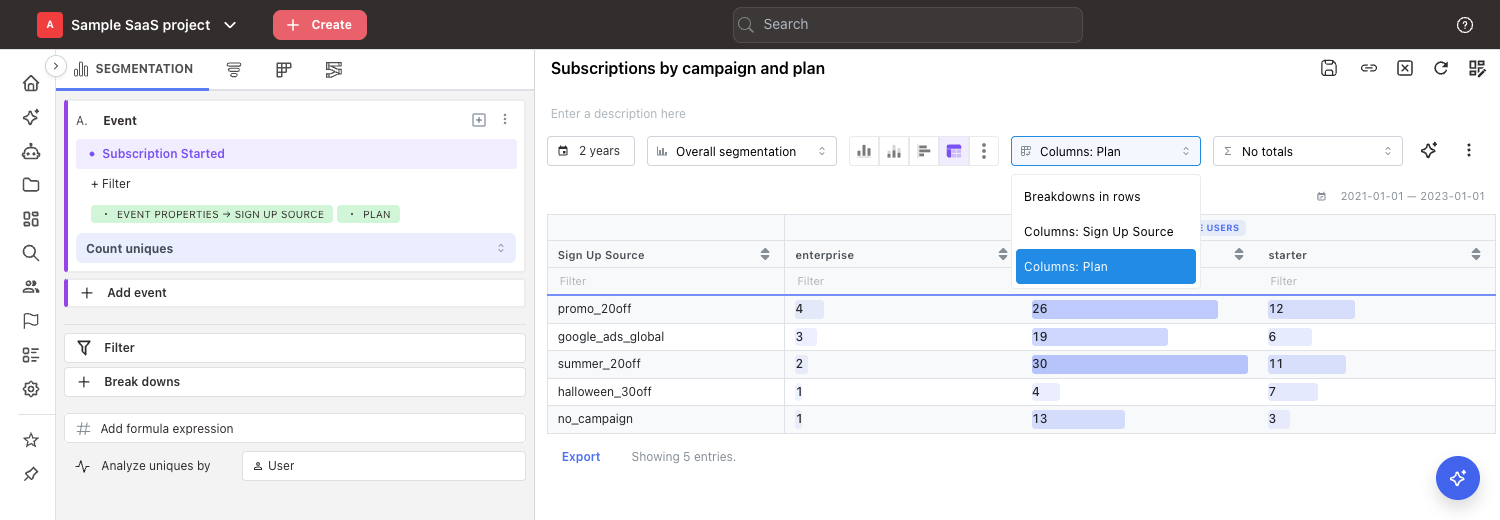
Segments— offered when the table holds two or more segments or calculations. Each segment gets its own column, and every breakdown becomes a label column on the left. This is the default.No column breakdown— nothing goes across the top. Each breakdown becomes its own column on the left, and you get a flat list with one row per combination. With two or more segments, each segment gets its own block of rows and a singleValuecolumn holds the numbers.Current vs. previous— offered when the insight compares against a previous period. Every breakdown stays on the left, and the columns arecurrentandpreviousside by side. See Comparing against a previous period.<breakdown>, for examplePlan— that breakdown goes across the top. Any other breakdowns stay on the left as labels.
Segments in the rows or in the columns
With two or more segments or calculations, the columns can hold the segments or one other
axis, but not both. Picking Segments keeps one column per segment. Picking anything else
(a breakdown, the periods, Current vs. previous or No column breakdown) moves the segments
down the left into a Segment column. Each segment then gets its own block of rows, in the same
order as in the editor, with the breakdown values inside it:
| Segment | Country | free | pro |
|---|---|---|---|
| A. Sign up · Unique users | US | 120 | 40 |
| A. Sign up · Unique users | DE | 80 | 22 |
| B. Subscribe · Conversion rate | US | 12 % | 9 % |
| B. Subscribe · Conversion rate | DE | 10 % | 8 % |
Because every row holds a single segment, a row never mixes a count with a percentage, and a
summary column sums or averages one segment at a time. With a single
segment there is nothing to arrange, so the Segments option is not shown.
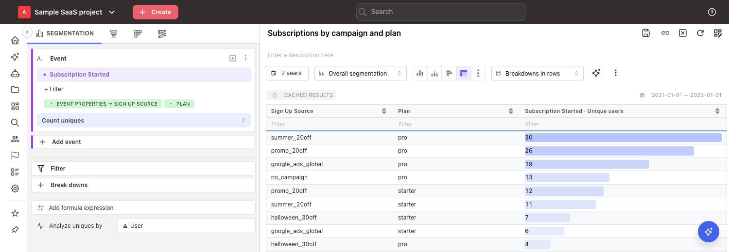
Only one breakdown can go across the top. If you have three breakdowns and put one across the top, the other two appear as two label columns on the left.
Choose the breakdown with fewer values for the top. A breakdown with 4 values gives you 4 readable columns; one with 200 values gives you a table you have to scroll sideways forever.
You can also use a breakdown set for the whole insight in the Break downs panel, not just one set
on a single event. Both kinds appear in the same dropdown.
Trends: the time periods are one more axis
On a trend the periods join your breakdowns as an axis of their own, named after the granularity —
Day, Week, Month and so on.
- By default the periods run down the rows, oldest first. A daily trend over 90 days is a 90-row table you can page through, not a 90-column one you have to scroll sideways.
- If the insight has exactly one breakdown, Mitzu puts that breakdown across the top for you the moment you switch to the pivot table: one row per period, one column per plan, country or whatever you broke down by. This is the layout most people paste into a spreadsheet.
- With two or more breakdowns everything starts in the rows, and you pick what goes across the top.
Week(orDay,Month, ...) puts the periods across the top instead, with every breakdown in the rows. It reads well for short ranges at a coarse granularity — twelve months, eight quarters — and gets wide quickly on daily data.
Rolling averages and cumulative sums are switched off while the pivot table is showing; the table holds the plain numbers. Your settings are remembered rather than discarded — switch back to a line or bar chart and they apply again.
Comparing against a previous period
Comparison works in a pivot table the same way it does on a bar chart: pick a window in the comparison dropdown and the table shows both periods. The column dropdown decides where the previous period goes.
- By default the previous period gets its own row, directly under the row it belongs to and
labelled for example
free (previous). Current vs. previousputs the two periods side by side: one row per breakdown value, with acurrentand apreviouscolumn. With two or more segments, each segment gets its own block of rows. Hover either header to see the dates it covers.
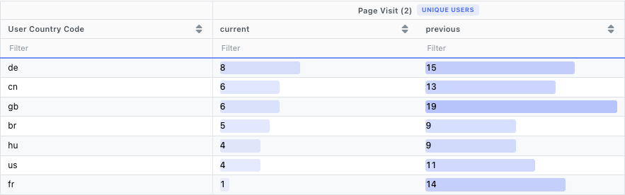
A value that occurs in only one of the two periods keeps its row; the cell for the other period shows the grey dot. On a trend the periods stay in the rows, so each row holds one period's value next to the value of the period it is compared against.
With the % formula the table holds the change itself, one column per event, so the side-by-side
layout is not offered. If you switch comparison off, the table goes back to No column breakdown;
pick Current vs. previous again once a comparison window is set. A saved insight keeps
the side-by-side layout: on a dashboard whose date filter leaves no room for the comparison it falls
back to rows, and returns to side by side once the comparison applies again.
Reading the table
The header has two rows. The top one tells you which event the numbers belong to and what is
being counted — Unique users, Event count, and so on. On a funnel it names the measurement
alone, because the whole funnel answers with a single figure. The row underneath lists the values
of the breakdown you put across the top. With the segments in the rows, the Segment column names
the event and what is counted instead, and the top header row names the breakdown across the top.
Bars behind the numbers show you how big each value is, so you can scan the table without reading every digit. Each event gets its own scale, so bar lengths are worth comparing within an event but not across two of them. That holds whether the segments sit in the columns or in the rows. Percentages and durations, such as a conversion rate or a median time to convert, get bars the same way: the longest bar is the largest value in that event.
Large numbers are shortened when Truncate numbers is on in the More menu, which it is by
default: 1,834,211 reads as 1.8M and 12,500 as 13K. Numbers below 10,000 are shown in full.
Hover a shortened number to see its exact value. The bars, sorting and the CSV export always use the
exact values, and image exports follow the same setting. Turn the setting off to see every number
in full.
A grey dot (·) in a cell means that combination simply didn't happen — nobody on the
enterprise plan came in through that campaign, for example. It is not the same as a zero.
Don't confuse the dot with <n/a>, <empty> and <not set>, which you will see as row labels or
column headings rather than inside cells. Those are real groups, holding the users whose property
had no value. The dot means a missing combination; those labels mean a missing property
value.
Rows start out sorted by the first column of numbers, largest first. On a trend with the periods in the rows they are in date order instead, and with the periods across the top each row is sorted by its row total.
The values across the top are sorted sensibly for what they are: numbers in numerical order, dates
in chronological order, everything else alphabetically. The <n/a>, <empty> and <not set>
groups always come last, so your real values stay together at the front.
Sorting, filtering and paging
Click any column header to sort by it: once for ascending, again for descending, a third time to return to the original order. Numbers sort as numbers, not as text.
Below the header is a row of Filter boxes, one per column. Type in one to keep only the rows
containing that text. If you fill in more than one box, a row has to match all of them to stay. The
counter underneath the table tells you how many rows are left.
The insights page shows 20 rows at a time. Dashboard cards and the agent's chat show fewer, depending on how much room they have.
Totals and averages
When a breakdown is across the top, a second dropdown lets you add a summary column.
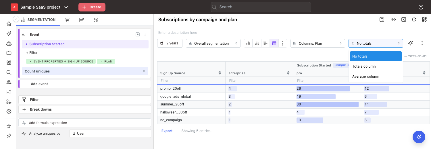
No totals— the default.Totals column— adds aTotalcolumn that adds up the row.Average column— adds anAveragecolumn with the average of the row, ignoring empty cells.
A Total is left as not summable when every column in the row is a percentage — a funnel's
conversion rate, or a % formula — because adding percentages together produces a number that
means nothing. The average of those same values is still meaningful, so Average column works.
With several segments in the rows, only the rows of a percentage segment read <n/a> in the
Total column; the other rows still get their sum.
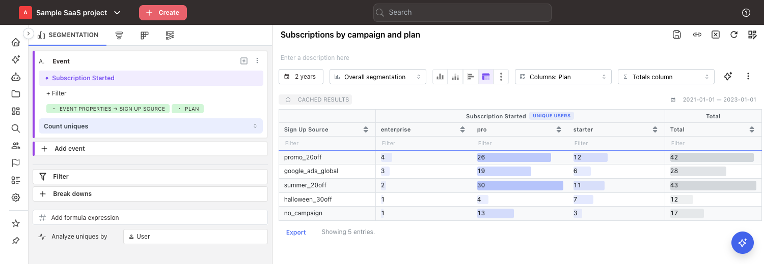
The summary column sits on the far right, with grey bars rather than coloured ones. It is almost always the biggest number in the row, so giving it the same colouring would flatten every other bar in the table.
A row total is not always the number you want. Hover the summary column header and Mitzu tells you which of these apply to your insight:
- If you are counting unique users, someone who appears in two columns is counted in both. A row total of 100 does not mean 100 different people — it is the sum of each column's own count.
- On a trend with the periods across the top, the same applies to someone active in two periods.
On a trend the useful summary depends on the orientation. With a breakdown across the top, Total
is the period's total across the breakdown values. With the periods across the top, Total adds
up the whole range and Average gives the average per period — the same number the standard
table shows in its AVG column.
While the comparison is side by side, the totals dropdown is greyed out: a row total would add the current and the previous period together. Your choice is kept and applies again once the comparison moves back to the rows.
Changing what goes across the top, or switching totals on, does not send a new query to your data
warehouse. The table dims and a Run button appears; clicking it rearranges the data Mitzu already
has, so it costs you nothing.
Funnels in a pivot table
A funnel produces one figure for the whole path, not one per step: the number a
Number chart shows on an overall funnel, and the one a funnel trend
plots per period. That figure is what goes in every cell, so a funnel pivot table is a grid of
whole-funnel results rather than a step-by-step breakdown.
Which figure that is follows your funnel's measurement:
| Measurement | What a cell holds |
|---|---|
Conversion rate | the rate from the first step to the last, as a percentage |
Converted users / Converted events | the count that reached the last step |
Avg. time to convert, P50, ... | how long the whole funnel took, with its unit on the value |
Sum of ..., Average of ... | the property aggregated on the funnel's last event |
On a reverse funnel the path runs the other way, so the figure comes from the first step instead of the last. (Reverse funnels don't support property aggregations at all, so that combination never arises.)
The header therefore holds a single column of numbers named after the measurement — for example
Conversion rate — rather than one column per step. Put a breakdown across the top and each of its
values gets its own column under that name: Conversion rate ▸ ios, Conversion rate ▸ android.
Rows and columns work exactly as they do for a segmentation. An overall funnel puts its breakdowns in the rows, or one of them across the top. A funnel trend puts the periods in the rows by default and, with a single breakdown, moves that breakdown across the top for you.
If you want the number for each step, the pivot table is the wrong chart. Use the bar chart, or the standard table under the chart, where every step gets its own pair of columns.
Totals column is not offered a number when every column is a percentage — adding two conversion
rates together gives a figure with no meaning, so the cell reads not summable instead. Use
Average column, which does mean something. A total is computed when you are counting converted
users or events — but a user who converts under two breakdown values is counted under each, so it
is the sum of the columns rather than a count of distinct people. Hover the summary column header
and Mitzu says which of these applies.
Calculations
Calculations work with pivot tables. Adding a calculation hides the segments it is built from, so the
table holds one set of columns per calculation, headed by its name, and your breakdowns are kept.
Show a segment again from its hide/show toggle and its columns appear next to the calculations'.
A calculation counts as a segment in the column dropdown: with segments in the rows, it gets its
own block of rows after the segments.
Without a breakdown, this gives a table of several numbers side by side — for example Visits,
Conversion rate and Average order value for this week, with a comparison row for the same week
a year earlier.
Calculations are a segmentation feature. A funnel has nothing to combine — it already answers with a single figure — so a funnel pivot always holds that one column.
When Mitzu can't build the pivot table
Every event in your segment has to be broken down by the same properties. The order you added them
in doesn't matter, but the properties themselves do. If one event is broken down by Plan and
another by Plan interval, there is no sensible grid to build.
The same applies to a funnel. Mitzu offers the breakdown dropdown on every funnel step, so if you
put Plan on step 1 and Country on step 2 the pivot has no grid to build either — give the
breakdown to one step, or set it once for the whole insight in the Break downs panel.
When that happens, Mitzu shows a Pivot unavailable badge, hides the pivot dropdowns, and falls
back to the standard table so you still get your numbers.
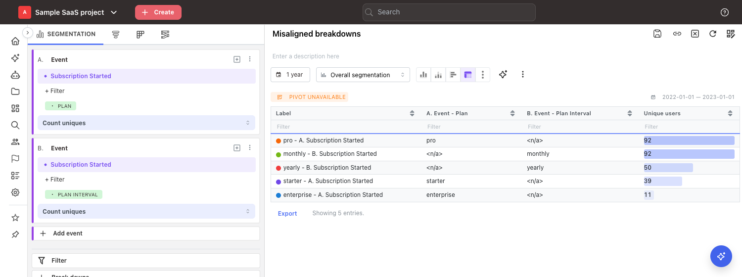
To fix it, give every event the same breakdowns — or set the breakdown once for the whole insight
in the Break downs panel, which applies it to all of them at once.
Exporting
CSV
The Export button below the table downloads it as mitzu-export.csv.
The CSV contains every row of the result, not just the page you happen to be looking at, with
the exact numbers even when Truncate numbers is on.
Image and clipboard
Image exports, dashboard thumbnails and emailed reports show at most 12 columns of numbers. When a pivot is wider than that, each metric keeps its latest periods — or its first values, for a text breakdown — and a note under the table says how many columns were left out.
Download chart and Copy chart to clipboard in the More menu give you the pivot table as an
image. This is also what gets embedded into dashboard PDFs and email reports.
Images can only show the first 25 rows, with a + N more rows note at the bottom telling you
how many were left out. Use the CSV export when you need the whole table.
Pivot tables elsewhere in Mitzu
Dashboards. A saved pivot table appears as a table on your dashboard card. Since there is no chart version of a pivot table, that card has no chart/table switch. Scheduled dashboard reports and alert emails include it as a table too.
Shared insights. Insights you share publicly show the full table, including the two-row header and the totals column.
The Mitzu agent. You can just ask for one: "show me subscriptions by plan and sign-up source as a pivot table". The agent will also choose a pivot table on its own when you ask an overall segmentation question with two or more breakdowns, because a grid is easier to read than a bar chart with dozens of groups stacked into it.
The agent builds funnel pivots too — "give me the visit to signup conversion by campaign as a table" — with the same one column of numbers the chart type has everywhere else. For a funnel it picks one only when you ask for a table, a grid or an export, or want every value of a breakdown too long for a chart, which draws only the top 10. As with any funnel, the breakdown sits on a single step. See the Analytics Agent page for more.
Limits
| Limit | Value |
|---|---|
| Breakdowns you can put across the top | 1 |
| Rows shown per page on the insights page | 20 |
| Rows in an image or PDF export | 25, then a + N more rows note |
| Rows returned from your warehouse | 20,000, then a Trimmed results badge appears |
| Length of a single breakdown value | 400 characters, then it is shortened |
Bar and line charts only draw the top 10 breakdown values, to stay readable. That limit does not apply to pivot tables — a breakdown with 15 values gives you all 15 rows.