Segmentation

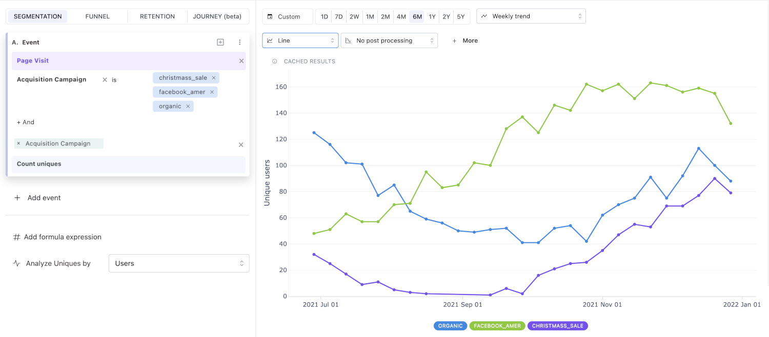
Segmentation is a powerful and flexible tool for visualizing trends and compositions in your data. You can analyze events, cohorts, and user profiles, and display the results in various chart types.
Advanced segmentation features let you add calculations and compare current and past data.
Use cases
Here are some sample questions you can answer with segmentation:
-
High-level product analytics
- How is my WAU (weekly active users count) changing over time?
- How often are my users getting value?
- What is the distribution of my users across regions, devices, etc.? (property breakdown)
-
B2B (in this case, a messaging application)
- How many messages were sent in the US in the past 30 days?
- How many users had a mobile app session yesterday? (unique events)
- How many messages are sent per session? (calculations)
- How much revenue was generated on plans purchased in the past year? (property aggregation)
- How has the power users cohort grown over the past 6 months? (cohort trends)
-
Marketing
- Which advertising campaigns generate the most checkouts? (property breakdown)
- Which advertising campaigns generate the most revenue? (property aggregation)
-
Revenue analytics
- Show me the change in MRR from our US-based customers over the last year.
- What is our current MRR?
Segmentation basics
You have already learned the basics of segments in Mitzu. This section covers the most essential segment concepts for user (or any other entity) segmentation.
Segmentation analysis
Segmentation analysis finds behavioral patterns in your user (or other entity) data. In Mitzu, segmentation focuses on comparing the behavior of different segments of users (or other entities) and identifying the differences between them.
Examples of segmentation analysis
Let's look at some examples of segmentation analysis:
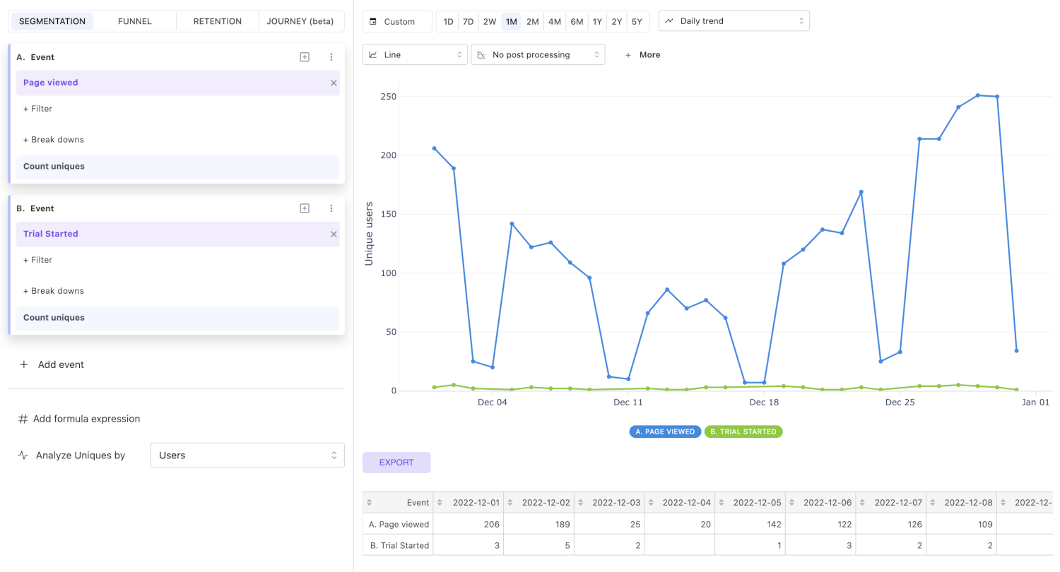
I want to compare the number of users who visited our landing page with the number who started a trial in the last 30 days.
This can be done by simply creating two user segments in the segments panel (left side of the page).
For the first segment, we choose users who performed the Page viewed event. For the second segment, we select users who performed the Trial started event. Both segment definitions will be decorated with the Count uniques aggregation. This means we will count the unique users in each segment, since the Analyze uniques by option is set to Users. We will set the time window to 1M and use the Daily trend measurement type. Finally, we will visualize this as a line chart.
Let's take this a step further and calculate the ratio between the two segments.
You can do this by adding a calculation under the segment panels. The expression should be A / B, where A refers to the first segment and B refers to the second segment.
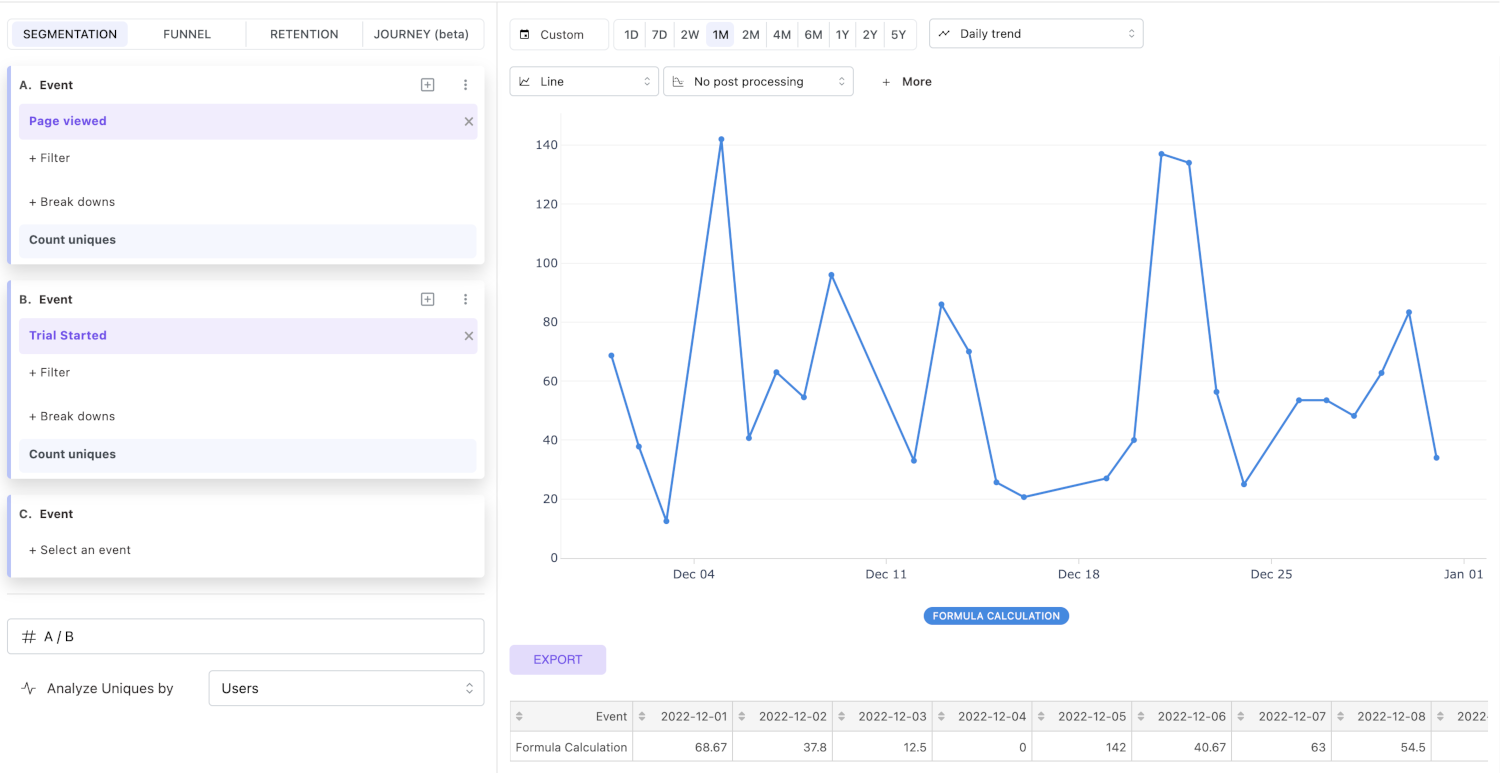
As you can see, there are, on average, 50 page visits per Trial started event, which is great for our hypothetical SaaS business. However, I want to see the big picture. Let's zoom out and see how this measurement has changed over the last six months. To do this, I need to change the time horizon to 6M and use the weekly trend measurement type.
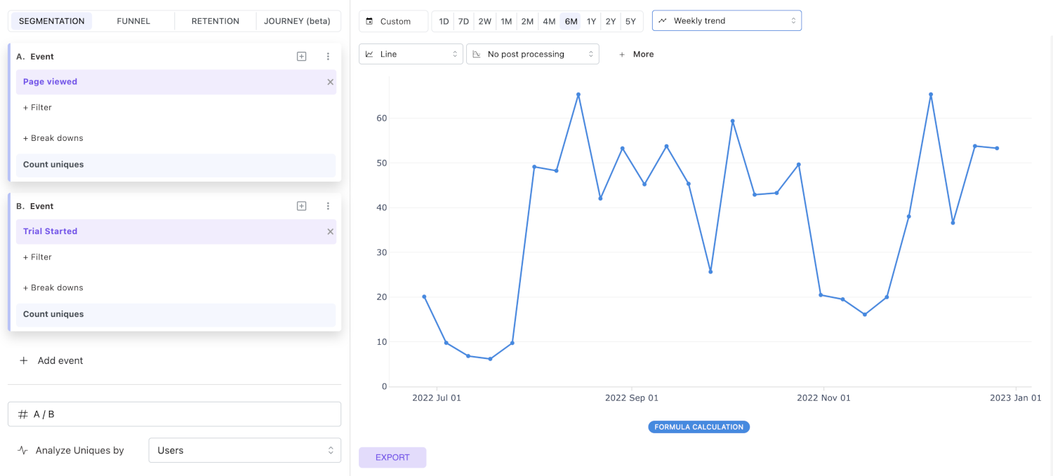
As you can see, the overall pattern stays the same. However, six months ago, we had a lot fewer page visits for every trial. This is something we should investigate further. In practice, to investigate further, I would switch to funnel analysis and see which marketing campaigns drove the most traffic to our landing page, and which had the highest conversion rate to trial-start events.
For now, I will stop here. This example was intended to show you what an investigation looks like in Mitzu.
Segmentation features
In this section, we will cover the features that extend the basics of Mitzu insights. Segmentation is a special insight type because you can select multiple segments of users for comparison. You can also choose how you measure the segments.
Segment aggregation types
You can perform per-segment measurements with the Aggregation type component.
By default, the aggregation type is set to Count uniques, which means we count the number of unique users in each segment.
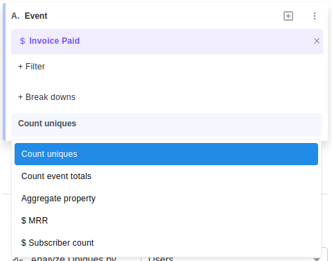
If the Analyze uniques by setting is set to Groups, Mitzu counts the number of groups in each segment.
If Analyze uniques by is set to anything else, such as session_id, count uniques measures the number of unique sessions in each segment.
Count event totals
This aggregation type counts the number of events in the segment.
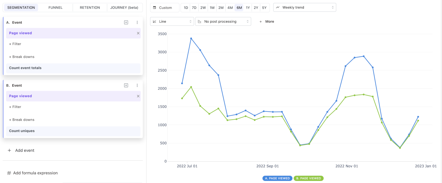
In the example above, two segment definitions were defined with the same event, Page viewed.
The blue line shows the number of events performed by the segment's users, while the green line shows the number of unique users in the segment.
Average
Average divides the number of events in the segment by the number of unique entities (users by default). It answers questions like "How many events does each unique user perform on average?" without forcing you to add a calculation.
This is equivalent to the calculation A / B, where A is the same segment with Count event totals and B is the same segment with Count uniques. Use Average when you want one segment instead of two.
Aggregate property
This aggregation type aggregates the property values of the segment.
- First, choose the aggregation function. Currently, we support the following aggregation functions:
- Count distinct
- Sum
- Average
- Min
- Max
- Median
- P75
- P90
- P95
- P99
Except for the Count distinct aggregation function, the aggregation functions only work with numeric properties.
How many different marketing campaigns did we run in the last 60 days?
This question can be answered by choosing the Count distinct aggregation function and selecting the Campaign property. This counts the number of distinct campaigns for which at least one page visit occurred.
Metrics
A segment does not have to be a single event. It can also be a saved insight, usually a funnel, reused as a segment. This is how you compare two funnels on one chart, or show a conversion rate next to the volume behind it. See Saved insights as series.
Calculations
A calculation is a formula over the segments of the insight, shown as its own series. The most common use is a rate: the number of events per user, or the share of one segment in another.
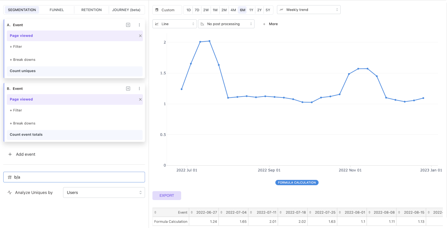
In the example, the calculation shows the number of events per user per day as a trend.
Adding a calculation
Click Add calculation under the segments. A calculation has a name and a formula expression.
The name is what the chart legend, the tooltips and the table show; leave it empty and they show the
expression instead. Use Add calculation again for a second one, so one insight can carry several
derived numbers, for example a conversion rate next to an average order value. With more than one
calculation, each label starts with the calculation's number (1. Conversion rate,
2. Average order value), the same way segments start with their letter, so two calculations with
the same name still show as separate series.
The ⋮ menu of a calculation offers Duplicate and Remove.
Formulas support the following algebraic operations:
+addition-subtraction*multiplication/division
Mitzu also supports parentheses () in these expressions.
Letters refer to segment definitions, for example:
A- the first segmentB- the second segment- ... and so on ...
To show a calculation as a percentage, prefix the expression with %: — for example %:A/B. This multiplies the result by 100 and adds a % sign to the chart axis, tooltips, and tables. (Writing (A * 100) / B also scales the value, but without the % sign.)
Calculations are best for ratios of independent metrics. When one action only happens after or because of another, use a funnel instead — a funnel's conversion rate joins on the same user and stays within 0–100%.
Adding the first calculation hides every segment and shows only the results. The segments are still part of the insight: each one has a hide/show toggle in its menu, so you can show a segment again and see its own numbers next to the calculations. That is how one insight holds a percentage and a plain count side by side. Removing the last calculation shows every segment again.
Calculation breakdowns
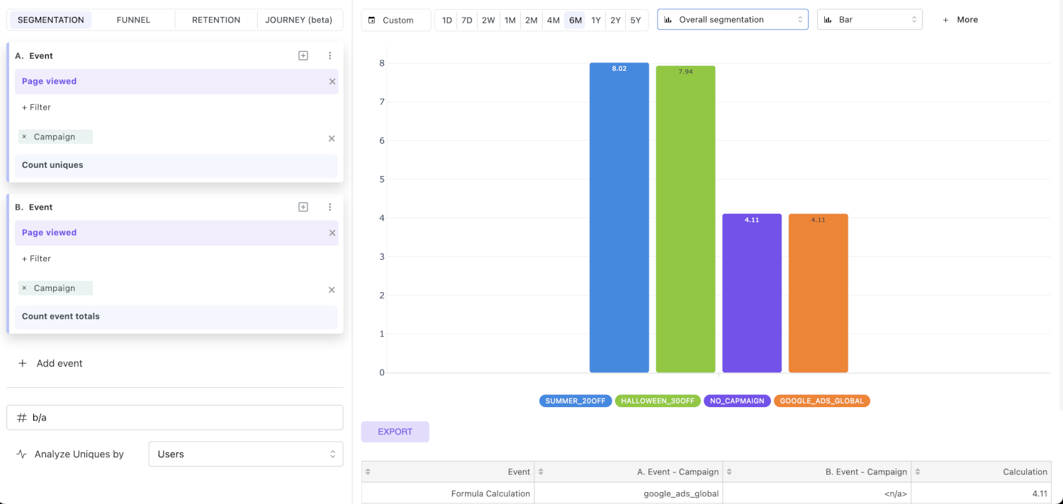
If you are using a calculation and want to break down your results by a property, the exact same property must be used in each segment definition referenced in the expression.
What is the average number of page visits per user per day, broken down by the Campaign property?
Post-processing
Post-processing options are only available in segmentation analysis. These operations are not performed in SQL in your data warehouse, but in the Mitzu backend on the result dataset.
Currently, we support these post-processing operations:
- Rolling average with various window sizes
- Cumulative sum
Rolling averages
Post-processing with rolling averages is useful for "smoothing" your result charts.
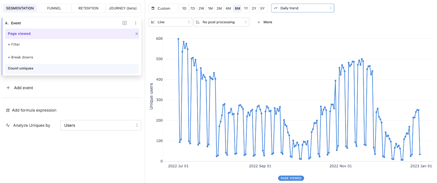
Without post-processing, the chart looks like this:
With post-processing, the chart looks like this:
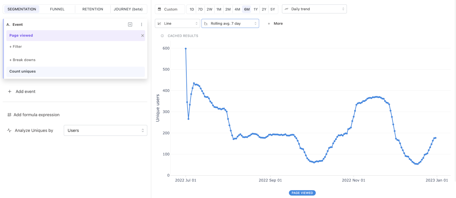
The overall trend is easier to read with post-processing.
Cumulative sum
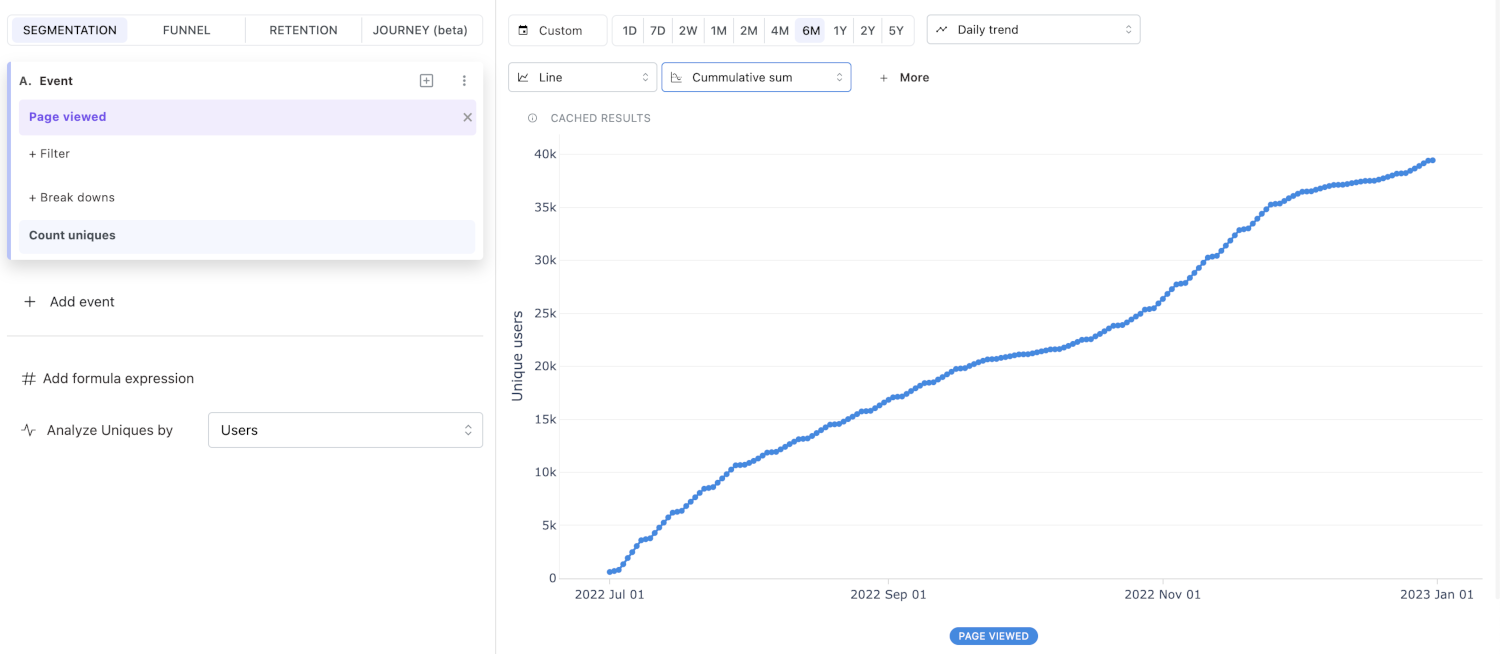
Cumulative sum helps you calculate the running total of any measurement. For example, how many total visits happened over the last 6 months?
Forecasting
When a trend granularity is selected, segmentation insights support Forecast from the More menu. This is most useful for monitoring metrics where you care about the upcoming trajectory (DAUs, weekly signups, MRR).
Segmentation insights support Uniques sampling, which reads a share of your users and scales the counts back up to full-population estimates. Event resolution is not offered, because a segmentation counts every event of the users it reads. Whether a new segmentation starts out sampled depends on the workspace's Apply entity sampling to setting. See Data sampling and resolution.
Comparison
The Comparison feature lets you analyze data trends by comparing them against those from a previous time period. For example, you can compare data points from the last month with those from the month before.
To use this feature:
- Select the desired comparison window from the dropdown menu.
- Choose a comparison method by selecting the appropriate icon next to the dropdown.
In segmentation, comparison can be performed using either of the following methods:
- Absolute values - select the
#icon. - Percentage values - select the
%icon.
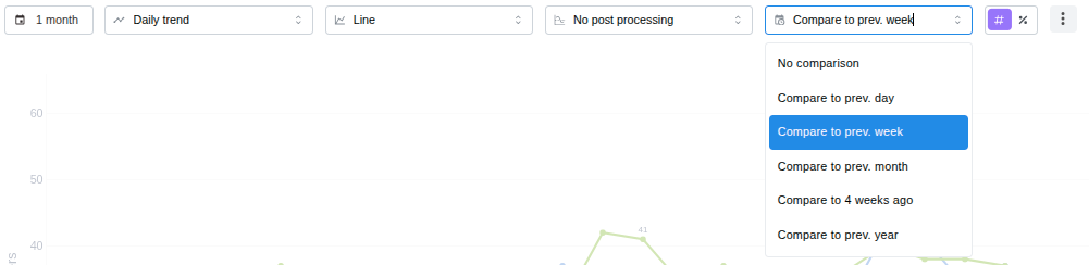
The dropdown offers No comparison, Custom… and, below the divider, the presets that fit
the chart's time grouping: Previous period, Previous day, Previous week,
Previous month and Previous year. Previous period is the window straight before the
selected range, as long as the range itself — six months on a six month range, nine weeks
on a nine week weekly trend. It is left out when another preset already lands on the same
dates.
Custom comparison
Custom… opens a window with two modes:
- Relative compares against a fixed distance back, for example
6Weeks ago. The distance stays the same when the date range changes. - Specific date compares against the period that starts on the date you pick, and is
as long as the selected range. It shows up in the dropdown as
From 2025-06-01. Above the date picker the window shows the insight's own date range, and below it the exact dates the chart will compare against.
On a weekly, monthly, quarterly or yearly trend the earlier period starts with the calendar week, month, quarter or year that contains the picked date, and each bucket is drawn beside the bucket at the same position. Pick 2025-06-04 on a weekly trend and the first week of the range is compared with the week of June 2. The dates named in the window, in the dropdown tooltip and above the chart are the selected range shifted back, so both periods read as the same length; the hint under the date picker adds where the first week, month, quarter or year actually starts counting.
The picked date has to leave room for an earlier period: on a trend it has to fall before the range's first bucket, and on an overall chart the whole earlier period has to end before the range starts. If you later change the date range so that the date no longer fits, the dropdown keeps it selected but the chart shows no comparison. Hover the option to see why.
A specific date stays fixed when the date range moves, so on a rolling range, such as the last 30 days, the distance between the two periods grows every day. The same happens on a dashboard whose date filter replaces the insight's own range.
Comparison with absolute values
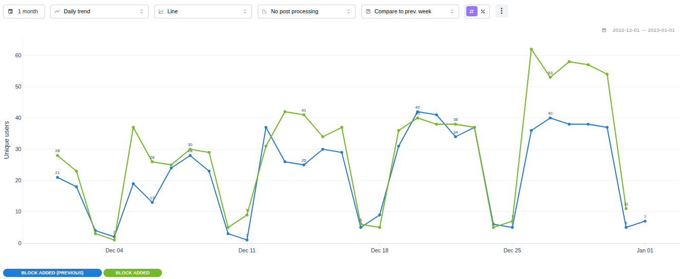
When comparing with absolute values, the system displays both:
- the data points from the selected insight time window, and
- the data points offset by the chosen comparison time period.
Both trends are visualized together on the same chart, making it easy to identify similarities or differences between the two time windows.
Comparison with percentage values
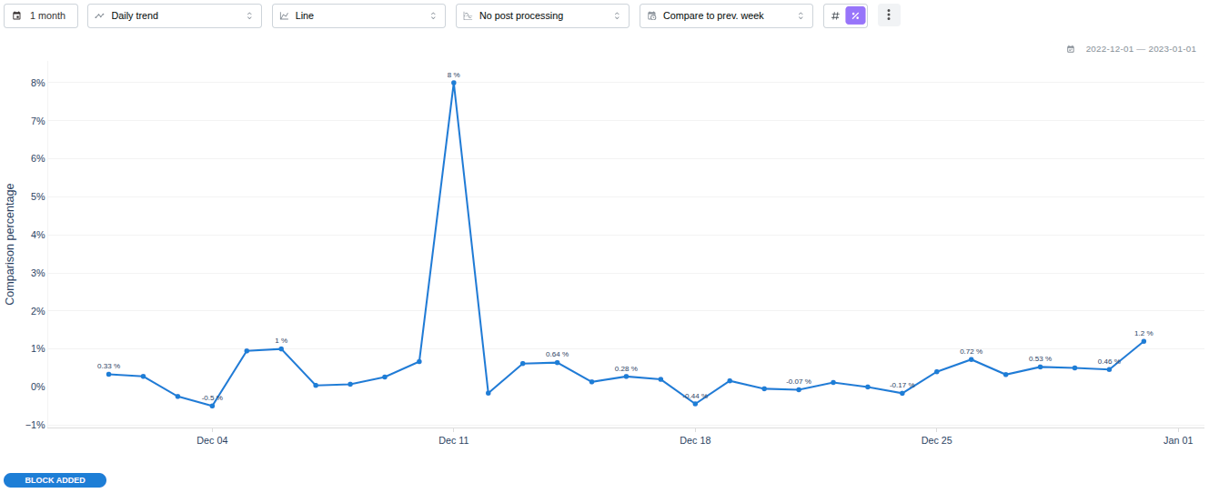
When comparing with percentage values, the system calculates the percentage difference between each data point and its corresponding value at the comparison time offset.
The result is displayed as a single trend line representing percentage changes over time, making it easy to observe relative growth or decline.
Comparison on overall charts
Comparison also works when the insight is set to Overall instead of a trend, which
covers the two charts most often pinned to a dashboard: the big number and the bar
chart.
Whichever chart it is, the window being compared against is named in the chart's own
date indicator rather than on the chart, on the same line as the range the chart
covers: 2025-02-01 — 2025-03-01 vs. 2025-01-01 — 2025-02-01 on the insight page,
and Daily, Feb 01 - Mar 01 vs. Jan 01 - Feb 01 in a dashboard card's header.
- A big number lays every segment out as a cell in a grid, separated by hairlines
and ordered by value, largest first — or alphabetically, when Order by breakdown
labels is on in the chart's
⋮menu. Each cell is centred and reads as three lines: the segment's key, its value, and the change. The change is a chip carrying a direction glyph and an unsigned magnitude —▼ 62— with the previous period's own value beside it asfrom 657. The chip follows the#/%choice above:#shows the absolute difference and%the relative change, and the previous value is shown either way. When the previous period is zero, no percentage is shown, because a change from zero has no meaningful percentage. A segment the previous window returned nothing for still shows its value, with a neutralno prior periodchip. At most ten segments are shown; a wider breakdown counts the rest below the grid as+5 other segments. Clicking a cell opens the same actions menu a bar or a pie slice does — see trends, filter on the value, create a cohort. - A bar chart draws the previous period as a second bar next to each current bar. With a breakdown applied, every value keeps its own pair side by side, and the previous bar is a faded version of the colour its counterpart uses.
The indicator is coloured by direction: green for an increase, red for a decrease and grey when nothing moved, in shades that stay legible in both light and dark mode.
The colour reflects the direction of the number, not whether the change is good. On a metric where falling is the goal — churn, error rate, time to value — a green indicator still means the number went up.
On an overall chart the offered comparison windows are only those at least as long as
the selected date range, so the two periods never overlap. A six month range offers
Previous period and Previous year; a seven day range also offers Previous month. This
differs from trends, where the window has to line up with the chart's time buckets
instead.
Previous year compares a custom or calendar date range against the same dates a year
earlier. A rolling range, such as the last 30 days, goes back 52 weeks instead, so
every weekday is compared against the same weekday. An overall chart over a rolling
year or longer goes back a calendar year, because 52 weeks would overlap it. A weekly
trend always goes back 52 weeks, which keeps its weeks aligned. Hover any option in the
comparison dropdown to see how far back it goes and the exact dates it compares against.
On a daily chart, each day is compared with the same calendar date. A date that has no counterpart in the earlier period, such as February 29, gets no previous point.
- A pivot table gives the previous period its own row directly under the row it
belongs to, labelled for example
free (previous). Its column dropdown can put the two periods side by side instead, as acurrentand apreviouscolumn under each event — see Pivot tables.
Pie charts, country maps and the stacked charts do not offer comparison. Each of them draws a single whole, and a second period has nowhere to sit in it: a stack would either inflate its own total or, on the percentage variants, rebase every share.